The analytics phase involved a deep dive into the international market and understanding the competitive set, the Gartner evaluations, and the key differences in go-to-market strategies and product offerings. This analysis was then compared to the qualitative insight from customer conversations and in-depth interviews with Ardoq management and employees.
The one notion of recommended action and focus? Simplicity and Clarity.
It may sound obvious, as every brand in the world can use a dose of either one of these statements. But for Ardoq, this meant truly focusing their brand on what they do best in the world; delivering decision–making tools that enable firms to transform – and win.
A global benchmark for profitable transformation
The new brand strategy, developed after weeks of collaborative work, defines a firm that wants to keep true to its Scandinavia roots, yet has an ambition to become a global technology leader attracting the best talent and the most recognized brands as clients. And at the same time developing technology that truly enables both leadership teams, and EA professionals to manage their digital transformations in the most profitable way possible.
At the top of the brand platform a simple, yet powerful purpose to be a company that actually loves change was introduced, and supported by a redefined vision of becoming the global benchmark for profitable digital transformations. All of it born in Scandinavia, yet made for a global world of changing business.

The well-established value system of being bold, caring and driven was kept and operationalized along with a strong set of new brand rules. By implementing these brand rules, the strategy went from something abstract to something tangible that directly impacts how Ardoq runs their daily operations. This is currently enabling everyone in the entire organization to stay on brand regardless of location, function or focus.
Strategy translated into a new identity
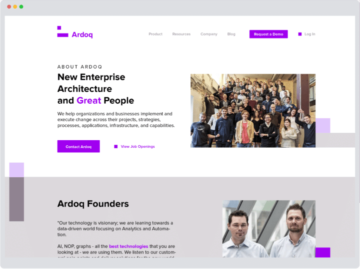
With the new brand strategy in pocket, a new visual design identity was required to manifest the new goals and signal the change. The new identity needed to match the growing ambitions of the firm, ensuring trust and focus, as well as showing the competitive edge immediately. However, the evolution of the identity needed to keep the agility and coolness of a relatively new technology brand alive.
The Brand Project’s strategic design team worked collaboratively with the Ardoq design teams to develop a revised identity enabling and supporting the strategic ambitions of the brand. A fast-paced, iterative process resulted in a clear direction and three design principles.
Executing on The Brand Project’s design principles for Ardoq 2.0
Design principles were created to guide the visual identity. By always keeping these principles in mind when designing, Ardoq’s messaging will always be consistent and on brand.
- Change
Ardoq loves change. When you see Ardoq, you will see change. The design shows movement towards the decision-making that their clients face. The change is in the subtle variations of the colors, the ever-changing patterns, the way humans look at information and data, and even the upcoming, correct decision.
- Balance
The right balance is visually established through shape and color. On one side, Ardoq is the safe bet! Solid and trustworthy. On the other side, Ardoq is a changemaker, a magician. Playful, even daring. So the way Ardoq shows data, the way it shapes itself and its logo mark, is restrained, shown through the rectangles. But the way Ardoq dresses, the way it colors itself, is bright and fun. That colorful playfulness balances the squared seriousness.
- Simplicity
Ardoq is all about simplifying. Helping its clients make the right decisions by untangling complexity. Pivoting data to make it simple from every angle. Striving to be synonymous with profitable transformation. The visual presence is simple and easy to understand.


Moving from theory to go-fast practice
Keeping up with a super–fast global scaleup that is in the middle of a series D funding round is no easy task. So going from theory to practice meant hitting the ground running from day one.
In close collaboration with different departments inside Ardoq, The Brand Project created the concept of Brand Coaches,employees in all locations that live and breathe the Ardoq brand.
These coaches were trained on the new brand, and are now having a daily impact on the brand-led operations of the company. Continuing on that effort, the rebrand was launched at a global kickoff and the implementation of Ardoq’s own transformation in both design and brand strategy was launched systematically, and across all entities.
The Brand Project is now working with Ardoq on establishing a strong brand and assists the company in developing their global presence and firm benchmark position.
Do you want to learn about Ardoq’s perspective on the project? Read their own take on this rebrand here.
Or talk to the client:

